There is no such thing as an alt tag. Alt is an attribute of the <img> tag: it holds the image’s alternative text, shown when the image fails to load, read aloud by screen readers and used by search engines to understand the visual. Syntax and writing rules apply to every medium. Newsletters add 2 difficulties: images that some email clients block, and image buttons that vanish along with them.
Alt attribute syntax
The alt attribute sits inside the <img> tag, next to src, which gives the file’s address:
<img src="logo-captain-verify.png" alt="Captain Verify" width="200" height="60">
Always set width and height too (here 200 x 60 px): these dimensions reserve the image’s space. When the email client blocks the file, the alt text appears in that area. The title attribute produces a tooltip on hover and never replaces alt.
Writing useful alt text
Describe what the image does in its context. The same photo of a phone calls for 2 different alts depending on whether it illustrates a product review or links to a purchase page. Ask yourself: if the image disappeared, what would the reader need to see in its place?
Keep it to one short sentence. Abondance gives a guideline of under 125 characters in its guide to the alt attribute (in French). That limit comes from publishers’ practice: WCAG 2.2 sets none. For a button, Mailjet recommends about 25 characters on a 200 px width, in its advice on alt text (in French).
Drop phrases like “image of” and “photo of”: screen readers already announce that it is an image. For a logo, write the brand name. For a “Download the guide” button, the alt “Download the guide” is enough: “blue button” tells a subscriber who can’t see the image nothing. Read it aloud to check.
Which alt for which type of image?
It depends on the image’s role in the message: carrying information or simply decorating. The W3C decision tree distinguishes 5 cases, from decorative to complex images. For a newsletter, 4 questions in this order are enough:
- Is the image inside a link or button? The alt describes the destination or the action.
- Does the image contain text? The alt repeats that text word for word, unless it already appears right next to it.
- Does the image carry information (an offer, a product, a chart)? The alt gives the essentials. Detailed data goes in the email as text.
- Is the image purely decorative, or redundant with the neighboring text? The alt stays empty.
| Image type | Recommended alt | Reason |
|---|---|---|
| Header logo | Captain Verify | The name identifies the sender |
| Image button | Download the guide | The alt describes the expected action |
| Banner containing text | Back-to-school offer: free shipping on orders over $50 | The image’s text is repeated in full |
| Chart | Open rates rising from January to June, details in the table below | Key message in the alt, figures as text |
| Divider or spacer | alt=”” | Nothing to convey |
Empty alt and decorative images
A decorative image gets alt="": the attribute is present but holds no text. Assistive technologies skip it. Leaving the attribute out has the opposite effect: some screen readers then announce the file name, which clutters the reading.
The W3C (WAI) calls for an empty alt when an image is a pure visual effect or repeats the neighboring text. The W3C lists spacers among decorative images. In an email, use CSS spacing instead (the padding of a table cell): then there is nothing to skip.
Standards: WCAG 1.1.1 and RGAA 1.1 and 1.2
Success criterion 1.1.1 “Non-text Content” of WCAG 2.2 is Level A, the most basic: all non-text content has a text alternative that serves the equivalent purpose. Pure decoration is the exception, provided assistive technologies can ignore it. The French RGAA 4.1.2 from DINUM (in French) carries this principle into 2 criteria of its Images theme: 1.1 “Does each informative image have a text alternative?” and 1.2 “Is each decorative image correctly ignored by assistive technologies?”. Version 5 of the framework is announced for late 2026.
For more on the email side, see our article on coding techniques for accessible emails and the one on email accessibility.
SEO and Google Images
Abondance lists image indexing among the reasons to write a careful alt, citing Google Search Central, the WHATWG specification and MDN. None of the sources consulted quantifies a ranking gain attributable to the attribute: keyword stuffing adds nothing and makes screen reader output worse. In a newsletter the SEO effect is negligible, since the message is not an indexed page, unless you publish a web version. On a website, also name the file with 2 to 4 words separated by hyphens, for example logo-captain-verify.png, in line with Abondance’s advice.
Common mistakes
- Omitting the attribute on a decorative image instead of writing
alt="". - Starting with “image of” or “photo of”.
- Listing keywords (keyword stuffing) instead of describing the image’s function.
- Copying the same alt onto every image in an email.
- Leaving important text only inside the image, with no HTML equivalent.
- Writing an alt longer than the image area: when images are blocked, it can get cut off.
Alt text in newsletters: blocked images
A website almost always shows its images. An email depends on each subscriber’s email client. That is where alt becomes a safety net.
In its guide to image blocking (published in 2017, updated August 17, 2021), Litmus names the Outlook desktop clients as the main blockers. Most other clients display images by default, with AOL as an exception. The mobile clients Litmus tested display them too: subscribers have to dig into settings to turn them off. Blocking is therefore mostly a desktop issue under Outlook. Microsoft sets Outlook by default to block automatic picture downloads. Gmail loads images automatically according to Google’s help page (the Always display external images option), unless the message or sender looks suspicious or the user asked for confirmation beforehand.
How much these subscribers weigh depends on your audience. Litmus cites Email Client Market Share: Outlook ranks 4th among email clients with 6% of opens. Litmus adds that this figure may be underestimated, since Outlook blocks the tracking pixel by default and those opens are then not counted. A B2B list is likely to include more of them, according to Litmus.
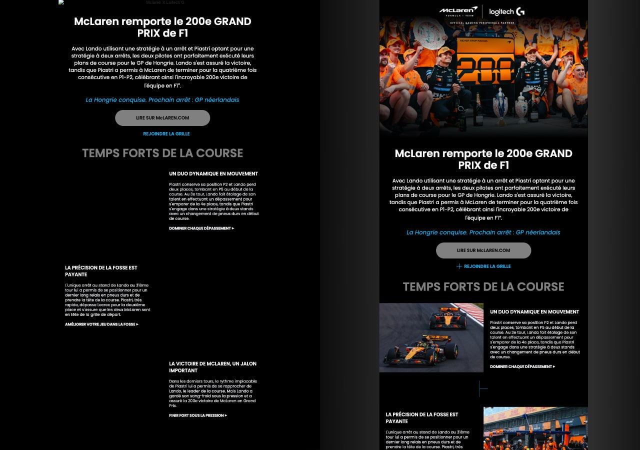
The screenshot shows the typical flaw: on the left, only the header image displays alt text, and it is tiny. The visuals in the blocks below stay empty. Litmus notes that in Outlook desktop the alt only appears after the warning banner, and only if images are disabled. A broken image displays nothing.
Styled alt text: which clients display it?
Gmail, Outlook.com and Apple Mail render styled alt text, while Outlook desktop 2007-2019 does not. Yahoo! Mail in webmail shows no alt at all, according to the Litmus table (updated in 2021). You style alt text with an inline style on the <img> tag, such as the text color and size.
<img src="button.png" alt="Download the guide" width="200" height="50" style="color:#0b5cad; font-size:16px; font-family:Arial, sans-serif;">
| Client | Styled alt | Good to know |
|---|---|---|
| Gmail | Yes | Images shown by default (Gmail help) |
| Outlook.com | Yes | Webmail, separate from Outlook desktop |
| Apple Mail | Yes | Tested by Litmus |
| Outlook for Mac | Yes | Separate from Outlook for Windows |
| Outlook desktop 2007-2019 | No | Plain alt only, and only with images disabled |
| Yahoo! Mail (webmail) | No | No alt displayed according to Litmus |
Litmus points out that Outlook desktop’s default blocking comes from its tests on Outlook 2016, not rechecked since. Run a fresh rendering test before building an email on this table.
Bulletproof button instead of an image CTA
A bulletproof button is a button built in HTML and CSS: a colored table cell holding a link made of real text. It stays visible and clickable with images turned off, where an image button disappears or shrinks to its alt. Outlook desktop has rendered HTML with the Word engine since Outlook 2007, as Microsoft’s documentation states. For those versions, some button templates add a VML (Vector Markup Language) fragment, not covered here.
<table role="presentation" cellspacing="0" cellpadding="0"><tr>
<td bgcolor="#0b5cad" style="border-radius:4px;">
<a href="https://example.com/guide" style="display:inline-block; padding:12px 24px; color:#ffffff; font-family:Arial, sans-serif; text-decoration:none;">Download the guide</a>
</td></tr></table>
The code above gives a button with 12 px of vertical and 24 px of horizontal padding, in #0b5cad with white #ffffff text. The same principle applies to any important text (headline, offer, date, unsubscribe link): in HTML, not in an image. An action link like the “add to calendar” button has to stay readable without images. An all-image email looks nearly empty in Outlook desktop until the subscriber downloads something. Litmus recommends keeping text and buttons in HTML: the best test remains readability without images.
Also keep a consistent plain-text version and watch the image weight, which affects how emails display for subscribers on slow connections.
Testing with images turned off
In Gmail, open Settings > See all settings, scroll down to the Images section and select Ask before displaying external images. Click Save Changes at the bottom of the page, then reopen your send. In Outlook desktop, blocking is on by default; otherwise open File > Options > Trust Center > Trust Center Settings and check “Don’t download pictures automatically in HTML e-mail messages or RSS items”. Complete the test with an email preview tool.
Check that the main button stays readable and that each alt makes sense on its own. Careful alt text won’t save an email that bounces: also run your list through an email verification before sending to catch invalid addresses.