


As the light dims, activating dark mode becomes second nature on our screens. Dark mode has permeated our digital habits and is also changing the way emails are designed and received. Adapting your campaigns to this new norm is no longer an option reserved for tech enthusiasts: it has become a necessary step, at the crossroads of visual comfort and accessibility requirements.
What is dark mode and how does it work in email?
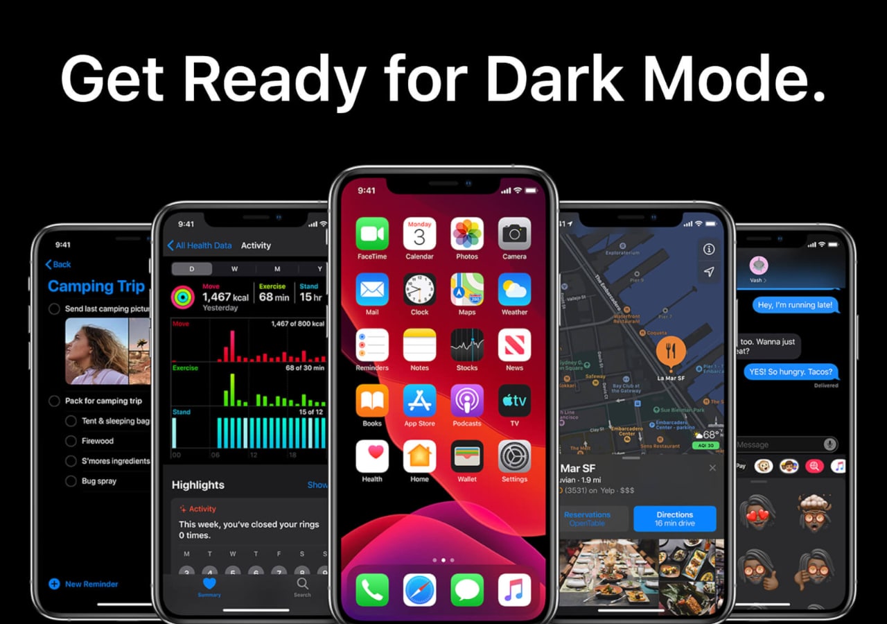
Dark mode refers to an inversion of traditional colors: light text on a dark background replaces the traditional bright backgrounds. This evolution benefits both the user and their devices, reducing eye strain and energy consumption on certain OLED screens. In the email universe, this mode is activated through the email client’s settings, adjusting the display according to each recipient’s preference.
In practical terms, this means that the same message can appear in very different ways without the creator’s intervention. Some email clients apply their own logic, reinterpreting the HTML and CSS code of the received messages. This process remains variable: two users receiving the same email may see radically different versions depending on their preferred application or platform.
Why does dark mode disrupt email design?
The impact of dark mode goes beyond mere aesthetics. This mode requires rethinking the visual hierarchy of messages: poorly contrasted text or an unsuitable image quickly becomes unreadable, exposing brands to degraded or even ineffective communications.
The main technical challenge lies in the diversity of treatments performed by different email clients. Some perfectly interpret the code intended for dark mode, while others alter or ignore certain CSS and color properties, making the results unpredictable. The constant evolution of software thus requires careful and regular monitoring.
Automatic transformations and their consequences
Some platforms automatically change colors, turning black text to white but sometimes arbitrarily. This manipulation can make a call-to-action invisible or harm the initial graphic coherence. Images with white backgrounds almost disappear, while logos on transparent backgrounds take on an unexpected halo.
In these situations, control momentarily escapes the sender. This instability forces a refinement of the graphic palette used and anticipates all possible combinations when creating the email.
Inconsistencies between platforms
Every service, whether it is Gmail, Outlook, or Apple Mail, applies its own method of integrating dark mode. It then becomes essential to systematically test the renders before any large-scale campaign. This explains the proliferation of tools and A/B tests dedicated to validating visual adaptations.
Some platforms now allow specific CSS directives (like @media), allowing precise differentiation of the rendering according to the activated mode. Mastery of these techniques is an integral part of the daily life of an email designer committed to ensuring a consistent user experience.
How to optimize an email for dark mode?
Optimizing an email campaign for dark mode requires a holistic approach, blending design, technical expertise, and anticipation. It’s not enough to darken colors; readability and comfort must be ensured, regardless of the software environment encountered.
From the mockup phase, it’s wise to adopt a mixed graphic style. Colors must ensure high contrast, in both light and dark modes. Special attention should be paid to text and action button areas, often subject to inversions or alterations imposed by some email clients.
- Favor contrasting palettes, avoiding shades too close to gray that might be erased by dark mode’s automatic inversion.
- Plan image variants, optimized for both light and dark backgrounds. Adding colored borders or margins around essential elements helps distinguish them from the background.
- Test emails on different platforms using specialized tools to quickly identify rendering flaws related to alternative display modes.
- Employ specific CSS rules: the @media (prefers-color-scheme) directive allows precise style differentiation adapted to light or dark modes.
- Limit the weight and number of images in each email to reduce the carbon footprint while ensuring rapid loading.
What graphic adjustments to adopt for successful integration?
Integrating dark mode into a successful emailing strategy relies on precise graphic choices. From the creation of visuals, consider the impact of the dark background on color perception. Some saturated shades stand out vividly, while others disappear, which can impair readability.
The format of images plays a crucial role. A PNG logo designed for a white background should have an alternative version for dark backgrounds. It’s better to favor vector formats or add a border to avoid any accidental masking.
Managing contrast and typography
Careful work on contrast ensures message accessibility. High contrast between text and background improves readability and reduces visual fatigue, even during prolonged reading. The chosen fonts must remain sharp, far from the ghostly effects created by dark mode’s automatic inversion.
Beyond colors, choosing robust typography and avoiding overly fine lines contribute to consistent rendering across all devices. Bold can serve as an effective emphasis where inversion tends to soften the message.
Eco-friendly digital design and dark mode
Adapting to dark mode also offers the opportunity to rethink the eco-responsibility of campaigns. Black pixels demand less from certain screens, extending the battery life of mobile devices. On the flip side, multiplying graphic versions or complicating HTML can increase the overall weight of each message.
It is then crucial to calibrate the image quality, limit their volume, and favor vector elements. Thus, dark mode reveals its full potential in terms of digital simplicity and performance.
| Element to Watch | Recommendation for Dark Mode |
|---|---|
| Background Colors | Use uniform dark shades to stabilize contrast |
| Texts | Opt for white or very light pastel tones on dark backgrounds |
| Images | Plan two versions (light/dark) and frame transparent elements |
| Call-to-action buttons | Enhance their visibility with strong contrast suited to both modes |
| Multi-platform Tests | Validate on each email client type before mass sending |
Towards a new norm for email design?
The rapid adoption of dark mode pushes every marketing manager to adapt their production methods. From now on, compatibility with this mode becomes a measure of professionalism and respect for the user experience, as one in two users regularly activates dark mode.
This chromatic shift renews thinking on the clarity, readability, and graphic coherence of emails. Observing how these practices evolve in the wake of upcoming innovations will undoubtedly offer new benchmarks for digital content creators.


")


